 I hear this phrase “best practices” thrown around a lot in the email marketing sphere. Even writing it just now made me cringe inside. Sure, there are some really, really basic best practices for email to follow, but there’s also a lot that’s changed for emails in the last month, let alone the last 5 years!
So, let’s ignore the dinosaurs and get the facts straight: here are 3 best practices for email you can ditch in 2017.
1. View on Web
 How often do you click that button when you’re sent an email?
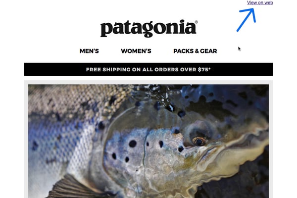
I subscribe to hundreds of brands and I check out every one of their emails — not because I’m a digital shopaholic, but because I want to see what other email marketers are trying. The one thing I see everywhere is the “View on Web” at the top of every email. When I’m going into post-send reports, I’ve seen very, very few users actually click that link. In the traditional sense, you would insert this link if a user didn’t have images on by default or for email sharing purposes. But if you’re handy at designing emails, they should work everywhere, thus making the View on Web button somewhat pointless.
Putting it at the top takes up valuable real estate and often deters users from opening your email. So, what’s the fix? It’s up to you, really. Try experimenting with the placement of the button (like moving it to the bottom), or remove it from the email entirely. I’ve even seen some emails have the link within the company’s logo.
Key takeaway: There’s a lot you can do with the View on Web button, so test out some of the aforementioned approaches and see what works best for you.
2. Visible preheaders
If you’re a recognizable brand like Patagonia or Nike, you might not have to worry about having a nice-looking inbox preview. But for the rest of us who have to play catch-up, the preheader is a chance to stand out among all the robotic emails individuals receive from lifeless brands.
In my opinion, preheaders are difficult waters to wade. For some emails, it’s used as an opportunity to send a user to the hero’s destination. It’s also a chance to make the inbox preview a little more personable and drive users to actually open the email. To each his own. I’m on the side of making emails welcoming, so I opt for using an invisible preheader that’ll only show up in the user’s inbox preview, like so…
![]()
![]()
There are a couple ways you can do this:
- Some ESPs have a built-in feature that allows you to add an invisible preheader before sending a mailing.
- You can go into the HTML and write a bit in your preheader, and then make it the same color as the background.
3. Web-safe fonts
There was a point in time when you could only use the following fonts:
- Arial
- Bookman Old Style
- Comic Sans MS
- Courier
- Garamond
- Georgia
- Impact
- Lucida Console
- Lucida Sans Unicode
- MS Sans Serif
- Palatino Linotype
- Symbol
- Tahoma
- Times New Roman
- Trebuchet MS
- Verdana
- Webdings
Many mailing clients — but not all — have upped their offerings in customization features, especially when fonts are considered. If you’re using a font like Roboto as your brand’s identity, you can now use that same font in your emails. Some ESPs like MailChimp have this already built in for a few web fonts, but for any others it’ll require some HTML work when you’re building out your mailings.
Key takeaway: There’s a lot you can do with fonts now on emails; just make sure you have a web-safe font as a fallback for mailing clients that don’t support customized fonts.
I’m sure there’s more to come, but that’s what I’ve seen so far on the interwebs. Find your own groove, and if you find a best practice for email that can be ditched, make sure to throw it in the comments so I can update accordingly!


