The logo is a key aspect in a brand’s marketing and advertising strategy. It is a symbol that represents your product or service, the front line of recognition that differentiates you from outside competition. When designing a logo, it is necessary to consider the effect of color choice on human emotions.
Jessica Ridgeway is a doctoral student at the University of Missouri. In 2013, she surveyed 184 adults on their impressions of several mock companies based entirely on their logos. The responses allowed Ridgeway to track patterns in the emotions evoked based on the color of the logo. The findings show that the color you choose plays a huge role in how your service or product is interpreted by the consumer.
What she found:
Green
Green logos instilled a perception that the company was environmentally friendly, tough, durable, masculine, and sustainable.
Purple
Purple logos invoked perceptions of femininity, glamor and charm.
Pink
Pink logos gave the perception of youth, imagination and fashion.
Yellow
Yellow logos were interpreted as fun and modern.
Red
Red logos evoked feelings of expertise and self-assurance.
Blue
After viewing blue logos, the consumer’s perception of the company was one of confidence success and reliability.
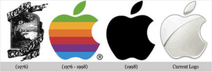
The evolution of the Apple logo is a great example of how simple color and design changes can majorly change brand perception. Check out this timeline of brand transformation from 1976 to now. Apple’s initial logo was cluttered and not essentially striking. Now when consumers see an image of an apple the powerhouse technology company instantly comes to mind.
The takeaway
Before choosing a logo color for your brand, evaluate how you want to be perceived by the consumer. Color (closely followed by shape, design, numbers, and words) is the visual component of a logo that people remember most - in fact, simply incorporating color increases brand recognition by 80%. Choose a color that correlates with the temperament and personality that you are trying to achieve. Be sure to incorporate all visuals into your decision and take your time to get it right. After all, “a picture is worth a thousand words.”


