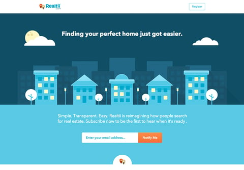
2014 has arrived and, with it, predictions on what is in and what is out. A prediction from The Next Web declared simple website content will reign over-complicated, content-laden sites. This trend caught my attention as a recurring theme in web design for the year ahead. Simple sites are not just on-trend but imperative in reaching your audience before they hit the dreaded back button. Before we explore how to accomplish a simple, organized site, it is important to understand why these types of sites are necessary.
Attention, attention: Don’t read all about it
As a wired nation, consumers expect insta-everything. Our world of digital distractions comes with a price, one of which is reduced attention spans. According to a recent study, attention spans have reduced to an alarming eight seconds (down from 12 seconds in 2000). With smartphones and tablets all but glued to our hands, users have adapted to the inundation of websites by quickly scanning content.
Adam Thierer, a senior research fellow in the Mercatus Center's Technology Policy Program at George Mason University, weighs in on the cost of our tech-filled word: "Long-form reading, listening and viewing habits are giving way to browse-and-choose consumption. With the increase in the number of media options — or distractions, depending on how you look at them — something has to give, and that something is our attention span."
What’s Social Got to Do with It?
YouTube, Instagram and Vine videos have conditioned our attention spans to short snippets of video. The 15-second rule was established for video ads after a poll was taken to gage appropriate ad length. YouTube accounted for the results in the length of their video ads (15-40 seconds), and new Facebook video ads will adhere to the 15-second guideline.
Six to 15-second increments may seem like too short of a time frame to get any meaningful message across, but according to Heather Taylor, a vice-president at Ogilvy, “The short form is extremely valuable, because we want to consume quickly … Brand Vines are shared four times more than other online videos, and five Vines are shared every second on Twitter.” Brands are digging deep to adapt to this new form of marketing, but from what we can deduce, the risk can pay off in multitudes.
Rules of Engagement
How do you grab your audience’s attention and keep it long enough to send your message? Follow these guidelines to create a simple and organized website:
- Page Load Time: Ensure that your web page loads in a timely fashion. Don’t give the user an opportunity to leave your site before they even see the content. Remember, you have eight seconds to reel them in.
- Tell A Story: Use a logical sequence when presenting information and if possible, tell a story with your content.
- “Chunkable” Content: Divide your content into chunks with no more than 250 characters per section. Allow users to quickly navigate and scan your site by using succinct yet descriptive headlines.
- Leave it to the interiors: Keep detailed content on secondary (interior) pages, but still attempt to keep the content organized and in chunks.
- Carousels are out: Eight seconds is not always enough time to digest content in a slide show format. Large intro areas are quickly replacing this format. Pick your universal message for the introduction so your user knows (in seconds) what your site is about. Include an impactful visual, plus a call-to-action.

- Keep it above the fold: Any vital messaging components must be above the fold (content viewable without scrolling). This includes a call-to-action button and helpful links. Do not rely on the footer for vital links.
- A touch of color: Limit your color palette to 2-3 colors (1-2 is better). Black and white are considered neutrals in this case. Use shades or tints of the same color to add texture or variety. Simply using black and white can be an effective approach especially when adding a touch of color for emphasis or dramatic impact.
- Bring on the videos: When possible, replace lengthy content with a video. Users are accustomed to viewing video content and are more likely to tune in to a concise, well-executed video than read large bodies of text. https://support.coinapp.co/hc/en-us site features a video above the fold with a large intro image that reflects the varied personalities of a Coin user.
- Long scrolling sites: Keep users’ attention by dividing your chunks of content into digestible sections in a long scrolling site. To do this, utilize ample white space and dividing lines or bands of color to change up the layout. Visuals and animation techniques like parallax scrolling will keep users engaged while scrolling.
- Bold, beautiful type: Don’t be a repeat offender with overused web fonts (ahem, Helvetica and Arial). Fonts with personality will draw in the user with intrigue. Sites like Google Fonts and Typekit by Adobe have changed the landscape of web fonts. A range of options is now at your fingertips, but seek fonts that are easy to read (especially for body copy) and limit the use of slab serif and script fonts to headlines.
Implementing these guidelines can be difficult and daunting. Working with a content strategist, user experience and creative teams can help guide you into making the right business decisions for your company.
Sources:
http://thenextweb.com/dd/2013/12/29/10-web-design-trends-can-expect-see-2014/9/
http://mashable.com/2012/01/23/ideal-online-ad-length/
http://www.statisticbrain.com/attention-span-statistics/
http://econsultancy.com/blog/10526-optimizing-your-website-for-short-attention-spans-six-tips
http://www.hongkiat.com/blog/5-tips-to-simplify-your-web-design/
http://www.fastcompany.com/3019652/dialed/6-of-the-most-creative-clever-uses-of-vine-in-marketing


