It’s no surprise, the COVID-19 pandemic has strained and reshaped many different industries around the world. One industry being thrust into new waters is higher education and specifically those focused on the trades. As a higher education digital marketing agency we wanted to take a closer look at how students' mindsets had changed. We conducted a student research survey aimed at understanding the pandemic’s impact on higher ed and found that 43% of all prospective students are considering delaying a new program. As a result, colleges and universities need an effective way to reach and appeal to new audiences like the tech-savvy Gen Z students and the non-traditional students looking for flexibility.
Ancora Education, a group of private, post-secondary career training schools, had been growing quickly in recent years as a result of acquisitions. Ancora offers programs in allied health, wellness, nursing, culinary/pastry arts, art and design, software development and IT, business and management, CDL truck driving, professional trades, security and legal trades, and skilled trades. With nine unique brands, seven of which we've worked on, and disparate websites in place that had become difficult to manage they saw a need to overhaul their digital ecosystem.

They knew they needed to appeal to the upcoming generations with eye-catching and functional websites accompanied by thoughtful content to support their training programs. There was just one thing holding them back – a need for a distinct and focused web presence for each of their unique school offerings. We partnered with them to create redesigned sites that accomplish the career training schools’ goals of a consistent look and feel, helped them convert students quicker, and provided their marketing team with a more robust understanding of their growing audience of potential students.

Ancora had two main goals that they wanted their new websites to accomplish.
The first was to gain a more robust understanding of their current audience of potential students; these insights would allow them to reach their current audience in a more meaningful way and expand to new audience segments.
The second goal focused on converting users to leads quicker; this came to life in the form of a website that provided prospective students with a wealth of information that strategically pathed them through to conversion.
We knew that Ancora’s audiences were unique compared to traditional higher education audiences. They share some similar audiences, such as recent or soon-to-be graduates, those who have not completed high school, and military veterans seeking a path after their service. However, some of their audiences are also very different and include those not interested or blocked from pursuing a four-year education. In addition, their core audience is hyper local as Ancora’s students do not want to travel far for their education.

So, how do we develop user experience and content strategies that speak to these student prospects? There are a few things to keep in mind with trade and vocational schools. First of all, they are stigmatized to be lesser options than a four-year university. On top of that, many of these students (especially non-traditional students who account for 8.2 million of the entire U.S. student population) face extremely high barriers to pursue further education in the first place. Barriers like a lack of at-home support, education cost, and child-care often deter them from exploring higher education options.
Once we had a good idea of the challenges the audiences face, we started to craft an effective strategy to get Ancora’s message to them. Our main goal with the sites was simple; put the prospective student in the shoes of their desired career, not in the classroom. Ancora provides quality education by placing the outcome of that education at the forefront. By doing so we are able to provoke inspiration in prospective students, and empower them to push through perceived barriers and to enroll at an Ancora school.

When researching and planning for this project, our team noticed one major challenge that all Ancora schools faced; a highly competitive space. With many students selecting schools close to home, it can be hard for vocational schools to attract potential students outside of their zip code.
Trade schools, community colleges, and in some cases, four-year universities all compete with each other to attract the same students. Ancora needed site experiences that could provide enough information to allow prospective students to feel comfortable picking a school that might be a little further away from home.
Higher education is a competitive space. We started by looking at how Ancora was messaging themselves against other schools in their space. We noticed that most other schools were not addressing prospective students' end goals or aspirations clearly. Whether that end goal is a career, continuing higher education, or something else, we wanted to make sure we spoke directly to students’ goals throughout the websites. Helping Ancora stand apart from other local competitors by putting the end goal front and center on the new sites was essential. This positioning allowed Ancora’s schools to display their unique attributes through post-graduation assistance, assuring students that they will be cared for in the long run and instilling confidence from the start.

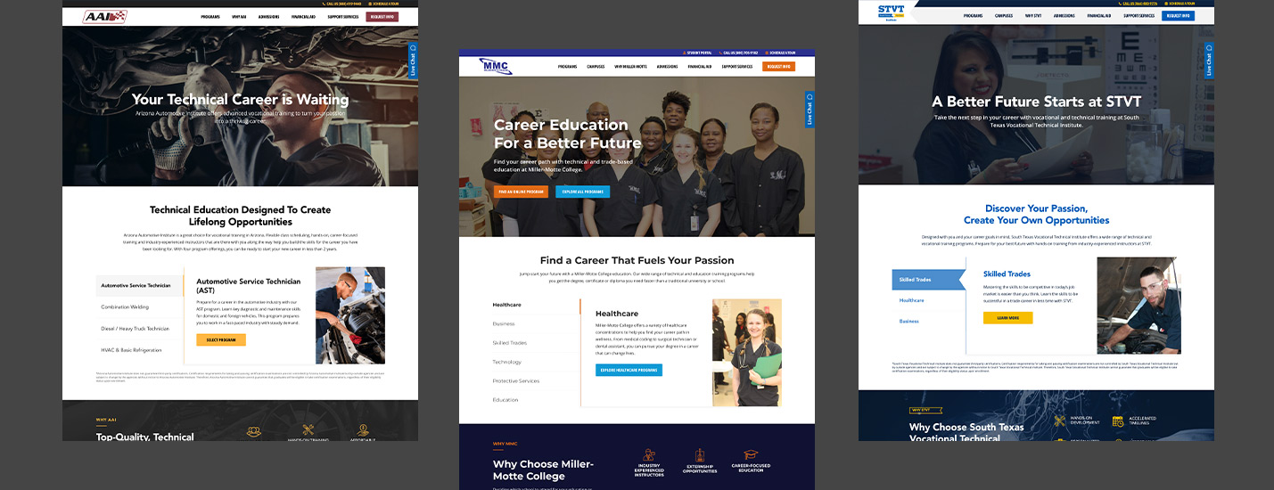
Knowing that Ancora had multiple schools that needed new sites, we proposed taking a templated approach to the project. We would focus efforts on the design of the first school, in this case, Arizona Automotive Institute and then carry that design on with adjustments for the remainder of Ancora’s schools, including Ancora’s Corporate Training site.
Not only did this approach keep a consistent look and feel throughout all of Ancora’s schools, but it was extremely cost-effective. With the framework for the remaining schools already built, we were able to cut down on development time and secure cost savings for Ancora on this project.
When designing the new websites, one thing became very clear: there was an apparent need to answer many of the questions that prospective students have. The websites needed a boost in the necessary information to enable prospective students to make a decision on the school. Many of the school’s websites were outdated, included little information, and displayed unclear calls to action that did not inspire the prospective students visiting them.
Our User Experience team was able to finely craft a user flow through each site uniquely optimized for converting students. In some situations, we even broke up the lead capture form into multiple steps, first asking about their interest in the program and campus, then gathering their contact information. This experience creates a connection with the student first, before pushing them to more tactical information gathering. We have seen success with this multi-step form method in our work with Universal Technical Institute and were excited to implement it here. Each school website, though built from a template, had its own unique take on conversion optimization built into the experience.

Typically, when talking about a website’s usability, we are thinking about the usability of the front-end. But, the usability of the back-end of websites is extremely important for marketers. Through this engagement, we built sites that both Ancora’s marketing teams and prospective students could confidently use.
The previous sites displayed some user accessibility issues that needed to be resolved that we made a priority from the start. Due to the attention to this detail, we are proud to say that all of the new websites are on track to scoring 90% and higher in accessibility testing.
On the back-end of the site, we utilized a drag-and-drop page builder called Elementor within WordPress to provide Ancora’s marketing team with a simple and effective site editor; this enables our clients to confidently use the websites we build for them. As partners with our clients, steps like this help us empower each other to be better marketers.
All seven of Ancora’s sites have launched and both the client and our teams are pleased with the outcome. For example, in just a month with their new site, Miller-Motte College saw a 21% increase in organic leads. Not to mention, by taking a templated approach to these websites, we were able to provide significant time and financial savings to Ancora as well. Below we've outline some of the preliminary results:
sites launched in 11 months
increase in Miller-Motte College’s organic leads (Mar 2021 - Apr 2021)
average improvement in ADA Scores (AAI & Miller-Motte sites)
improvement in security scores (AAI & Miller-Motte sites)
improvement in speed scores (AAI & Miller-Motte sites)
As we continue to monitor the websites’ performance, we are confident that we will see even more impressive results from this project. Going forward we plan to work with Ancora’s Miller-Motte Wilmington location on a social media strategy and paid social campaigns focused on student recruitment. As we continue to tie together the new site experience and their digital presence it will serve their prospective and current students even better than before.

Bridging the Gap Between Student Needs and Marketing Strategies